The thing about TED Talks is that it’s impossible to watch one without coming away caring deeply about something you’ve literally never thought about before. Today, I watched “
The Worst Designed Thing You’ve Never Noticed” given by Roman Mars – whose presentation was equally as awesome as his name. Mars’ began by joking about his setup, as he was seated at a large desk with a microphone and soundboard. He explains he’s going to recreate an episode of his radio show. This interesting format definitely made me interested in what was going on, and the topic only hooked me even more.
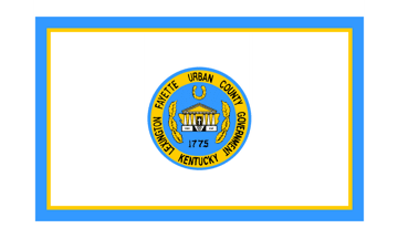
Mars’ speech was about flags. Specifically, flag designs, especially city flags in America. He brought up the five elements of good flag design: keep it simple, use meaningful symbolism, use 2-3 basic colors, no lettering or seals, and be distinctive. An excellent note made was that a design should be simple enough that a child could draw it from memory. For comparison, here’s what I just found out the city flag of Lexington looks like:
Eeeeeeyeah. But compare that to the city flag of Amsterdam:
To quote Roman Mars, it’s “…the most badass city flag in the world”! So clearly high standards of flag design exist! Even comparing the state flag of Kentucky to my home state of Tennessee feels pretty lacking:

I distinctly remember having to draw the state flag in third grade, along with our seal. The flag is definitely a whole lot easier! I love our flag. Kentucky…. not so much. The flags of Kentucky and Lexington are both just their seals on a solid color background, which violates at least three of the five basic rules of flag design: simplicity, no lettering (or seals at all!), and distinctiveness. Every city or state that has a seal in its flag looks more or less the same, unless you get close enough to read the lettering. And that’s counterintuitive to the whole idea of a flag! Mars’ passion on this topic really shone through as he showed examples of amazing and terrible flags, and it’s hard to stop it from rubbing off on you. If I had lived in Kentucky long enough to know anything about it, I’d probably try to design a flag myself!
Mars’ use of his radio-style setup while giving the speech was immediately fascinating. It made me think about the level of comfort he has with that type of speechmaking as opposed to pacing around an empty stage in front of everyone, and how he used familiarity to ground himself. His use of sound clips from interviewees (I presume from the original broadcast of his radio show) was effective, but in some cases heavily overdone and sometimes pushed too close together. The Powerpoint slides accompanying his speech were relevant and not overdone, and were very well used to give examples of flag design.
It seems he may have made use of notecards, as he glanced down a lot, but this also could be due to the sound clips he frequently played. His actual speaking was, as near as I can tell, flawless. I don’t think I heard a single stammer or “like-um-uh”s, and his steady radio voice carried the entire performance excellently. The “radio voice” did at times come across as a little too steady, and was almost monotonous, but as he got further into the speech his passion and interest kept me absolutely interested. The audience was included very well, as Mars’ gave frequent examples as he was speaking, and addressed them specifically many times, such as asking if they knew what their city flag looked like. He also used humor to great effect, by being outwardly passionate about his subject and by giving well-timed punchlines (like Milwaukee’s city flag!) (Yes, Milwaukee, you’re a punchline. Sorry.)
Overall, Roman Mars was an excellent speaker and gave a very interesting speech on an unusual topic. I’ve already spent a lot of time looking up state and city flags, and daydreaming up better designs for most of them (Kentucky, I’m still looking at you). I really recommend giving this a watch, and I can almost guarantee you’ll come away with a brand new special interest.
 Singultary has two entrances, one for everybody and one in the back for handicap/elderly individuals. I had to open the doors for the patrons coming through because the buttons that open the doors can be hard to find. I also had to make sure I helped them over the bump where the entrance was to prevent any major injuries.
 When the concert came to a conclusion I went out to the lobby to be a bouncer. Time for three was going to be outside signing CD's and taking pictures with people, and to make sure no crazy super-fans attack the artists. I was behind the desk unwrapping CD's and making sure nothing bad happened to the performers. I got to talk to them and they told me how much fun the concert was and we took a picture, but my phone broke so I don't have the picture. This was my last time volunteering with the Philharmonic as part of this CIS class but I hope to continue this in the future.